Sunday, November 15, 2015

Photographer Highlight

One  of the most famous in the world, portrait photographer Annie Leibovitz has forever changed the game.

Annie's career as a professional photographer began in 1970 with Rolling Stone magazine. By 1973, she was doing so well that she was promoted to chief photographer. Her career continued to rise. In 1983 Annie became chief contributing photographer of Vanity Fair magazine.

Throughout her fantastic career Annie Leibovitz has been granted numerous awards and honors. In April of 2000,  Annie was given the "living legend" award from the Library of Congress. She was also made a Commandeur des Ordre des Artes et des Lettres by the French government. In 1991, Annie was the second living person to ever have work in the National Portrait Gallery.

What sets Annie apart from other portrait photographers is the way that she always tries to capture the essence of her subject matter. Whether this means following and hanging around them for days, or incorporating a story about them into the frame, Annie's portraits always teach you a little more about the subject.

Even to those uneducated in the arts, Annie has become a household name throughout the world for her work with famous celebrities. One of these photos features John Lennon and his wife, Yoko Ono. This was taken the night before his death and was the last photo ever taken of him.


Another of Annie's iconic celebrity portraits is of Whoopi Goldberg, done for Vanity Fair. She photographed Whoopi in a tub of milk to showcase that Whoopi is black, thriving in a typically white career.

It is unanimous amongst the world that Annie changed photography. Stephen Armstrong from The Guardian stated that " Leibovitz helped change our view of the importance of human endeavor." Keepsnap.com calls her "Annie Leibovitz or woman who changed photography."

As one of the many photography greats, Annie Leibovitz has forever impacted the worlds of portraiture and photography for the better.

Thursday, November 5, 2015

Five Elements of Design

Although art is subjective, there are certain rules of photography that can make or break a photo. These are called the elements of design. There are five; value, emphasis, balance, unity and movement.

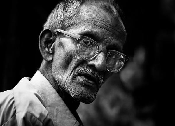
Value refers to the darkness or brightness/contrast in a photo. Photos with good value showcase beautiful highlights and shadows. 


Below is a photo with good value:
*Note the range of shadows and highlights*


Value is extremely dependent on lighting. To gain a deeper contrast of highlights and shadows, one must use a harsher light source. In contrast to this, if softer contrast is appropriate, softer lighting should be used.

Emphasis pertains to the focal point of an image. The focal point is where you would like viewer's eyes to be drawn. In order for a photograph to be strong, it should have high emphasis. Emphasis can be placed through depth of field, placement of the focal point, colors or any other features that could cause it to stand out. In this image emphasis is created through the color of the red flower.


Balance is how the subject matter of a photograph is placed. Good balance keeps a photograph from becoming over crowded, and makes it pleasing to the eye. Two of the most popular types of balance design are the rule of thirds, and radial design. To use the rule of thirds, you must imagine a 3x3 grid on top of the photo. Subject matter should cover 3/4 intersections, leaving one open. For example:
In a radial design, all subject matter splays out from a center point. This can be showcased in the image below:


Unity is what ties everything in a photo together. Without unity, a photograph feels odd and mismatched. Repeating colors, textures, sizes and shapes are all examples of ways to showcase unity. In the image below unity is created through the repeating shapes.


Last, but not least, is movement. Movement refers to how a viewer's eye is drawn throughout an image. Movement can be showcased through pathways, overlapping or frozen motion.

Pathways:
Overlapping:
Frozen Motion:

All of these elements can be remembered through the acronym VEBUM (pronounced v-bum).By ensuring that these elements of design are present in a photograph, one ensures quality.

Thursday, October 29, 2015

Instagram vs VSCO?

The rise of technology brings about numerous options for photo-sharing. Two options trending at the moment are Instagram and VSCO.

Instagram is a photo dedicated social media app that has been around for years. As of December 2014, Instagram had 300 million active monthly users. VSCO on the other hand is a baby in comparison; it was launched only two years ago, in June 2013. VSCO holds 20 million active monthly users. Each app has it's own pros and cons, leading people to wonder: Which is better?


instagram logovsco-cam


Below are several categories in which both apps can be compared.

Editing:


Exposure
Clarity
temp.
tint
skin tone
grain
shadows tint
highlights tint
lux
Instagram


X
VCSO
X
X
X
X
X
X
X
X


crop
pic-stitch
filters
straighten
contrast
fade
color
warmth
tilt-shift
Instagram
X
X
X
X
X
X
X
X
X
VSCO
X

X
X
X
X


brightness
structure
saturation
highlights
shadows
vignette
sharpen
Instagram
X
X
X
X
X
X
X
VSCO


X
X
X
X
X

App Store Rating:
Instagram: 3.5 Stars (current version), 4.5 Stars (all versions)
VSCO: 3.5 Stars (current version), 4 Stars (all versions)

In-app Camera Adjustments:
Instagram: flash
VSCO: flash, grid overlay, instant capture, low light compensation, white balance, ISO, screen contrast control

Video Support?:
Instagram: yes
VSCO: no, but the new update allows GIFs and there is a separate app for videos

Social Aspects:
You can follow others on both apps, but only Instagram allows you to see who follows you and who others follow, on Instagram you can like photos but you cannot on VSCO

With each comparison in mind, it is up to the individual as to which app they prefer. Some people like the social media aspect of Instagram, while others like the photography focus of VSCO. Feel free to try out both apps and comment which you prefer!